Comprehensive Website Analysis: Nike
1. Emotional Appeal 9/10
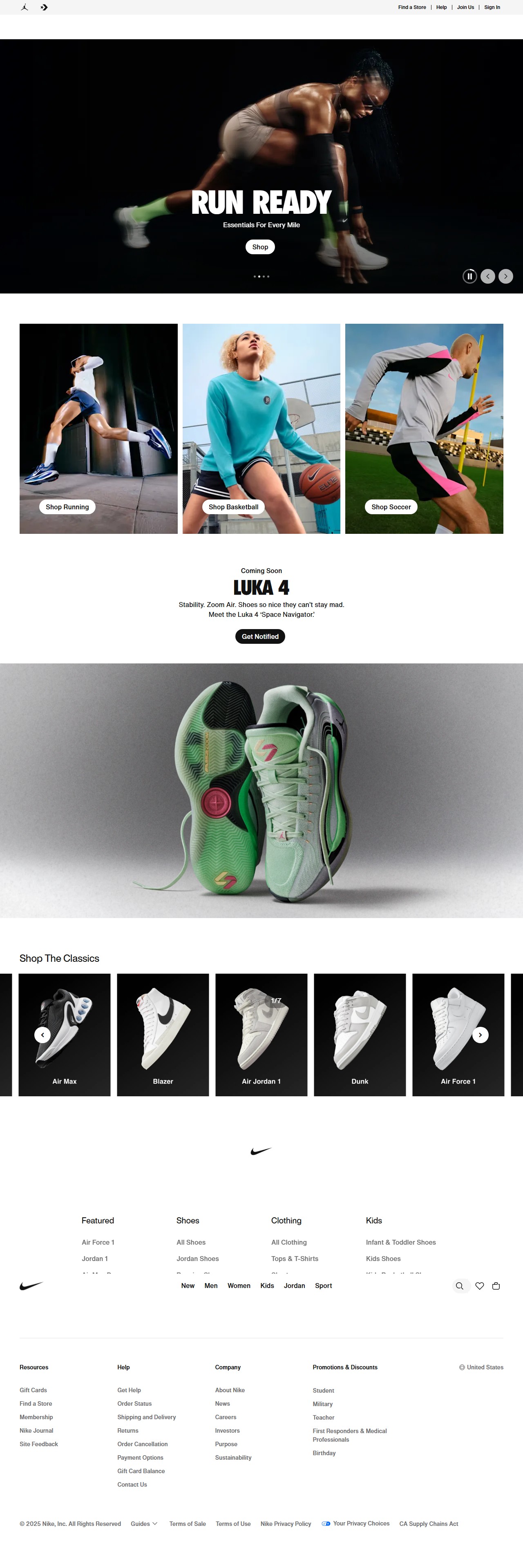
The Nike website effectively uses emotional triggers through its dynamic imagery and powerful messaging. The prominent "RUN READY" headline creates a sense of motivation and preparedness. The motion-blurred image of a runner conveys speed and intensity, immediately connecting with athletic aspirations.
The featured athletes across different sports (running, basketball, soccer) showcase determination and focus, appealing to both competitive drive and personal achievement. The "Essentials For Every Mile" tagline speaks directly to runners' dedication.
The upcoming "LUKA 4" shoe promotion uses stability-focused language ("Shakes so nice they can't stay mad") that appeals to performance-oriented consumers. The color palette maintains Nike's bold, energetic brand identity while allowing product colors to stand out.
The only minor limitation is that some emotional connections might be more resonant for existing athletes than those new to fitness.
2. Layout & Design 8/10
Nike employs a clean, structured layout with excellent visual hierarchy. The navigation bar at the top features key categories (Now, Men, Women, Kids, Jordan, Sport) that are clearly delineated. The search function and shopping cart are appropriately positioned in the upper right, following e-commerce conventions.
The hero banner occupies prime real estate with a clear CTA ("Shop") centered beneath the headline. The three-panel sports category section creates balanced visual weight with consistent CTA placement across each image.
White space is used effectively to separate content sections and create breathing room between elements. The product showcase at the bottom utilizes contrast against the gray background to highlight the shoe details.
The design appears to follow responsive principles with elements that would likely stack appropriately on mobile devices. The only detraction is the slightly cluttered bottom section where the shoe close-up might benefit from more focused presentation.
3. Typography 9/10
Nike's typography choices excel in both branding and functionality. The bold, sans-serif headline fonts used for "RUN READY" and "LUKA 4" create strong visual impact while maintaining the brand's athletic, contemporary identity.
Body copy is highly legible with appropriate sizing for hierarchy—larger for headlines, smaller for descriptive text. The consistent use of clean, sans-serif fonts throughout creates a unified reading experience.
Text contrast is generally excellent, with white text standing out clearly against dark backgrounds. The typographic hierarchy effectively guides users from main headings to supporting text to CTAs.
The font choices perfectly balance brand personality (bold, confident, modern) with readability, making information accessible while maintaining Nike's distinctive voice.
4. User Experience (UX) 8/10
Navigation is intuitive with a standard horizontal menu bar containing clear category labels. The search function is prominently displayed for users who prefer direct search.
CTAs are consistently styled as buttons with high visibility ("Shop," "Shop Running," "Shop Basketball," "Shop Soccer," "Get Notified"), making desired actions clear. Each CTA relates directly to its contextual content.
The product categories are logically organized with visual cues, making it easy for users to browse by sport interest. The "Coming Soon" promotion includes a specific "Get Notified" option that enables continued engagement.
While mostly strong, the UX could be improved in a few areas. The favorites/wishlist icon in the header is somewhat small, and the website lacks visible breadcrumb navigation for complex category browsing. There's also limited evidence of accessibility features such as alt text in this static image.
5. Brand Consistency & Positioning 10/10
Nike demonstrates exceptional brand consistency throughout the website. The Nike swoosh logo appears prominently at the top left, following brand guidelines. The color scheme adheres to Nike's established palette, and the imagery consistently portrays athletic performance and quality.
The website clearly targets active, sports-oriented consumers across multiple demographics, with separate navigation for men, women, and kids. The featured categories (running, basketball, soccer) reflect Nike's core market segments.
The premium positioning is evident through high-quality photography, professional athletes, and product close-ups highlighting technology and design details. The upcoming Luka Dončić signature shoe emphasizes Nike's continued focus on professional athlete partnerships and performance technology.
The messaging consistently emphasizes performance, quality, and athletic identity—all core elements of Nike's brand positioning. The overall presentation reinforces Nike's market leadership in athletic apparel and footwear.
Summary
Key Strengths:
- Powerful emotional appeal through dynamic imagery and motivational messaging
- Exceptional brand consistency across all elements
- Clear product categorization by sport with intuitive navigation
- Strong typographic hierarchy that balances impact with readability
- Effective use of CTAs that guide users through the shopping journey
Major Weaknesses:
- Limited visible accessibility features
- Slightly cluttered product showcase section
- Lack of breadcrumb navigation for deeper browsing
Actionable Suggestions:
- Enhance accessibility with higher contrast ratios for text against image backgrounds
- Add breadcrumb navigation for improved orientation in product categories
- Consider a more focused presentation for the bottom product showcase with fewer, larger images
- Increase the size of utility icons (favorites, cart) for improved tap targets on mobile
- Add filtering options visible on the main page to help users narrow sports categories more efficiently